Showing posts with label process. Show all posts

Friday, August 10, 2012

HE IS CALLING - Pt.2 - The Color Study


When I was in art school, my instructor ALWAYS insisted on doing color comps and studies of our paintings. It took awhile for that to really sink in with me, I always thought it was unnecessary extra work and that I could just jump right into the final painting because I "knew" what it was going to look like when I was finished.  But after a few dozen of crap paintings where I get to a certain point and say to myself, "okay, now what?"  I'd always find myself in a rut, with a painting that looks like somebody did not  know what they were doing and you could tell when my paintings looked like it was worked and re-worked to death only because I had no idea what direction to take it.... if only I had a map. OH! So THATS what those are for!?  Now, depending on the project, I sometime do my color studies digitally, this has it's ups and downs.  It's handy to do quick digital color comps because you can adjust overall color schemes immediately and fix issues very quickly. But the downside to that is if you plan to use traditional paints on the final, if you are like me, find yourself trying to figure out how to mix certain colors to get it the way you have it on you comp.  So anytime I am able to do a REAL PAINTED color comp I will leap at the chance.  All you are doing is creating a guide for the final painting. In this particular case, I knew I would be painting a 24x48 painting so laid out my pencil sketch on a 12x24 gessoed masonite board.

Remember last post where I mentioned a BIG little advantage I have? Well this is where it comes into play. My full time day job consists of designing things, but not super awesome Cthulhu creatures and half naked sea-girls. Nope, I am a graphic designer and large format print specialist here in Nashville at a place called ProGraphics. We have two flat-bed printers that will allow me to print on pretty much ANY flat surface up to 1.75" inches in thickness and 4'x8' in size.

Here are a few shots of this process:
(these shots are from the actual 24x48 painting, not the color study from this post)

BEFORE

DURING

AFTER

SO! As you can see I have developed a nice little technique I like to use on larger paintings. I will draw my pencils at a more comfortable size for me (normally around an 11x14ish size area)  then scan in my pencils and fix any blunders in Photoshop and then enlarge my drawing to the desired size and just print my pencil sketch directly to my masonite board.  Call me lazy if you will, I like to think of it as being time efficient.  Doing this method allows me to cut out the light table or  projector  or however else I used to get my sketches to the board.  Sometimes, I'll print the sketch at around 10-20% opacity and go back and re-draw a much finer detailed render. But in this painting's particular case, I knew it would be loaded with paint so I decided I could just use my original sketch as my pencils and jump right into painting.

On to the fun part, the PAINT! I'll spare you the play-by-play, I'm using acrylics and this was painted over a span of about 2.5 hours.


Below is the final color comp scan, if you noticed, I switched his hand from the original drawing, but before I started the final, i went and had a friend pose his hands for me so I could a good exact idea how the hand would be gripping the top of that rock. (see the first pic where I digitally fixed the hand, and on the pencils as well for the final.)


So below is what the color study looked like sitting beside my ready-to-paint final image.
I may post another quick post of some of the progress shots on here before the show, but if you follow my on twitter, instagram, or we are friends on Facebook then you can catch up to date action as it unveils. :)


ALSO!  I'd like to point out again that the above COLOR STUDY FOR THIS PAINTING, a 12x24 acrylic painting will be up for grabs the night of the show, all you gotta do is order your tickets in advance here. It's only $10 a ticket with no added fees and this will ensure your name gets into the random drawing to win this piece!

As, always, thanks for viewing the posts and I hope you've enjoyed this little endeavor!

*** UP NEXT ***

I will be posting a few of the sweet Lovecraftian swag items I designed for the show. Political  yard signs just in time for the elections as well as a fun little homage (ripoff) of a pretty popular poster design.

Also a sweet little keepsake for my own selfish reasons but which will be fitting for the show.

See you next time!
-b


Wednesday, August 8, 2012

HE IS CALLING - Pt.1 - The Sketches


I'd like to share a few process shots of my latest painting "He is Calling" which will be on display at the CTHULHU CALLING art show, an H.P. Lovecraft inspired show I am hosting on August 18th here in Nashville at the CULT FICTION UNDERGROUND at LOGUE'S BLACK RAVEN EMPORIUM.

So, first things first. Sketches. 
I made about a dozen or so sketches of different layouts and ideas for this piece and finally came to one I really liked and ran with it. Below are a few of the rough sketches that made my personal cut for certain reasons for each.


Once I was happy with how Cthulhu would be posed, It was time for me to work on my border design, I had an Art Nouveau kind of theme going on in the event poster, so I wanted to make sure I kept the same flavor here. (For the keen eye, take note of the lovely ladies donning the top corners of the design, look familiar?)  This is where the computer is my friend. I know lots of artists who would cringe at the sheer thought of only drawing one side and then duplicating it over for the other side. But in my defense, I'm only doing it to the pencils to speed up the process, once I start to actually paint this, the symmetry looks more natural and not as "exact" from left to right. It's just one of the many short tricks I sometimes use when I'm in a tight deadline (I'll show you another BIG little trick that I use for speed purposes a bit later as well! There are hints on the pics that bookend this post.)

We got our Sketch all laid out in photoshop, have all the parts fixed up for the rough painting of the color study! Which we will cover in the next post!  


ALSO!  I'd like to point out that the COLOR STUDY FOR THIS PAINTING, a 12x24 acrylic painting will be up for grabs the night of the show, all you gotta do is order your tickets in advance here. It's only $10 a ticket with no added fees and this will ensure your name gets into the random drawing to win this piece! 


That about wraps this post up, stay tuned as I will literally post pictures from start to finish.. mostly, of the color study to this painting (which again, will be given away at the show, all you gotta do is buy your ticket online and just be there around nine o'clock pm)

Thanks again for checking out my post. I hope to see you all at the show! Come say hello and tell me how much you hate it when artist's cheat by using computers only to be lazy.  :)
-b


Saturday, August 4, 2012

CTHULHU CALLING: the poster process

I have a few blog posts coming down the pipeline about our upcoming show Cthulhu Calling : A night of Art inspired by the works of H.P. Lovecraft.  (psst... TICKETS ARE STILL AVAILABLE HERE!) So first things first... the event poster I just recently posted, I'd like to share a few of the steps involved in creating this piece. Now let it be known, I'm a huge fan of the amazing Art Nouveau master Alphonse Mucha, so in his honor I wanted to do a poster that would maybe resemble something that would have been around when he was making art. (note: I did not say "a piece that would look like something HE would make... cause let's be honest, there is only one Mucha!)

It all starts with a few rough thumbnail sketches in the ol sketchbook. Here you can see the one I thought was the most interesting.


Once I find a rough design I like I jump to a little larger sized paper and go to town by sketching out the design and making sure the composition will still work on a larger scale. notice the face and feet.. they are terrible, I know, I'll fix that stuff next!


OKAY! we got us a good design going, lots of things to fix here so this is where I normally do one of two things.... either scan the sketch in and enlarge it to the final drawing size, print out and basically re-draw it agin, with much cleaner lines. OR take it into photoshop and digitally start drawing the final layout.  With this particular case I had just acquired a super duper sweet Wacom Cintiq so naturally, I wanted to test this bad boy out!  So to photoshop we go!


Below are the final inks for the poster. Not bad for the very first thing to come out of using a cintq.
As you can see here, I fixed my anatomy issues and drew a new face. Another great plus doing this digitally, I drew about 10 faces before settling on one that I liked, believe it or not, it's pretty tricky to get a subject as this to teeter on the verge of beautiful and creepy at the same time.


So, now that the hard part is finished we get to the fun stuff!! COLORS! Keeping with the art nouveau theme I chose to go with colors that were a standard i printing back at the turn of the century, with a few rule benders in there for the tentacles of course. :)


That about wraps this post up! Again, be sure to grab your tickets for the show here! It's August 18th at Logue's Black Raven Emporium in East Nashville. We have about a dozen artists all representing different aspects of Lovecraft. We will have original art as well as limited runs of prints, woodblock prints, sculptures, original independent films and many other fun things as well!  Not to mention we will be giving away art and have fun Lovcraftian trivia! So bring your Lovcraftian knowledge A-game as well as your wallets! Most of the art will be for sell ranging from "super cheap" to "totally worth it!" Cash bar and food too! See you there! :)

ALSO!! If you pre-order your tickets before the night of the show, you will be automatically entered for a chance to win a very special treat from me! (It has paint involved, FYI)

BUY TICKETS HERE!

FOLLOW THE OTHER ARTIST'S PROGRESS ON OUR FB PAGE!


********* UP NEXT********

HE IS CALLING. - Join me as we step into the world of madness as we journey through the steps of my latest piece for the show!

Wednesday, January 26, 2011

The A.T.T. - Part 2 - The Maquette


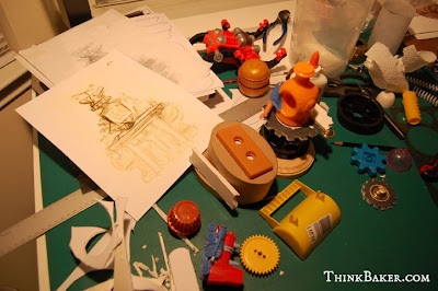
At Goodwill you can get a "grab bag special," which is essentially a clear plastic bag for two bucks and as many broken toy parts you can cram into said bag. What you see on the left is the chaotic mess from one of these fun and hand-sanitizer-required-afterward expeditions.


James Gurney has been preaching about maquettes and their usefulness on his blog for ages. Although I had known about them in school, I'd never actually tried building one. With each new concept, I worked, re-worked... and kept re-working an illustration trying to capture something that I just could not translate without seeing it in the environment I was trying to illustrate. Using the maquette saved me a lot of valuable time because I could easily visualize what each shadow, or ray of light would look like because the photo reference for it was right there. Each illustration required less tweaking and I was able to complete them much quicker than with no reference.

When it came time to create the maquette of the A.T.T., I used the opportunity as another "sketching method." I still was not absolutely set on a design, and since I was creating it from scratch I had free range on experimenting. Using the interesting shapes of old toy parts, foam board, and other random materials, I was able to create my own Frankenstein of an Automated Torque Telegrapher. Once it was completely assembled, I painted it flat grey to make it appear more seamless, easier to capture shadows, and reflect light in photographs.


The fun thing about building maquettes is that you can be as precise or uncomplicated as you like. The ultimate goal is to get the information you need out of it, whether it be a certain pose, the perfect angle, or most importantly, how lighting and cast shadows fall on your subject. I've gotten quite a few miles out of just this one maquette. I've used it for several panels in the web comic as well as faux newspaper articles, and eventually I might make a "blueprint style" poster of the Automated Torque Telegrapher. Until then... it rests happily in my studio with all the other clutter of maquettes, books, and scribbles just waiting for the day I need to draw the A.T.T. once more.


In the next post, I'll share a few of the finished illustrations/designs that I have referenced this maquette for.

Until Then,
-b

*****************

You can view the A.T.T. in action in the
Apparition Abolishers webcomic


See the sketches of the A.T.T. - HERE


For some of the very best tips and tricks of illustration art,
visit James Gurney's blog - GurneyJourney,

Saturday, August 21, 2010

Soldier of Misfortune - Process


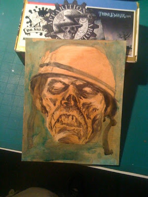
This piece started out as just a test on a new type of technique with new mediums I was not too familiar with. But as I painted I grew very fond of this lil' feller. Below are a few shots I took while I was painting. Beginning with the pencils I had drawn on just some strathmore comic book paper. In the picture you will see it's wet because I had just mounted to a piece of masonite with matte medium. Once it was dry I went to town on this thing with gouache paint.


Thursday, March 11, 2010

MidSouthCon... here we come!

I owe you guys a peek at the poster I made for MidSouthCon. This will have to do, it's the pencils for the "group shot" that is on the MSC poster (which also has the portraits I created)

I will post the FINISHED poster tomorrow morn as we head out of Nashville to Memphis for the Con.

See you in the Morning! :)


OH YEAH! I almost forgot! JEFF PRESTON has allowed us to share a little treat as well.... but ONLY for the con goers! So the lucky people of the con will be able to be the FIRST to see the Apparition Abolishers Illustration by the Mighty Jeff Preston! whee!

Are you excited yet?

-b

Thursday, February 18, 2010

Torque's Lab - thumbnails part2


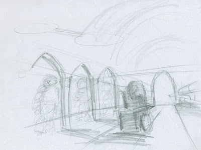
The whole point of the quick thumbnails is so that I will have a map as to how I want the story to unfold. They are very crude as you can see, but their only intent was to get the story down onto paper while I still had it fresh in my head. That way I can later go back and reference them when I am drawing more realized layouts without worrying about the story continuity as much.


Now I am able to go back and basically redraw the scenes with a bit more attention to overall design more conscious of the perspective and details of each scene. Some of these images will be different in the final cut and some might not actually make it at all. It's just better for me to just keep drawing fast loose renderings and then be able to take away rather than struggle for content.

These will then go through another phase where I will bring them into Photoshop and fix all perspective issues and create pretty tight color comps before I go to the final pencils.


The goal here is to fully realize the entire painting before I even begin the paint process. I want to work out all my kinks early on so I can just have fun when the paint starts flowing.


I'll try and post some of the color comps next week.
-b


Wednesday, February 17, 2010

Torque's Lab - thumbnails part1


After the abstract thumbnails I did about two weeks ago. I was able to revisit my original thumbnail sketches (below) and try to make what I thought was a bit crammed and bland into something a bit more exciting and interesting. The abstract thumbnails helped me find new perspectives and overall better layouts of what I thought should be an over the top underground laboratory of whom a few have considered "The Tony Stark of the Victorian Era." With a title like that, you can't just cheapen out on the grand introduction of his laboratory. I needed bigger and better. So what was a measly two pages, has now turned into EIGHT, most are full page illustrations too. Full of steam, gears, airships, nautical ship, gentlemen robots and the introduction to the first Abolisher. (finally!)


(initial thumbnail sketches = poo)

Needless to say, I have my work cut out for me. :)
Tomorrow I'll post some more refined sketches and maybe you can actually understand what the heck you're looking at up there.
-b

Monday, February 15, 2010

The Road to MidSouth Con - SIR QUINCY


Back again with another Abolisher portrait. This week we have Sir Quincy Peck. Next week will be our fourth and final portrait with yours truly aka Jasper Dunlap. and a sneak peek of the new poster which will be available at MidSouthCon the weekend of March 12th - 14th.

Thank you for viewing. and see you Wednesday when I will post the next stages of Dr. Torque's underground secret laboratory!

-b


Wednesday, February 3, 2010

Abstract Thumbnailing

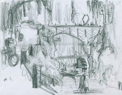
About two years ago a member of Gorilla Artfare and amazing artist Adam Paquette posted a really creative way of creating down and dirty super quick abstract-like thumbnails. I mentally filed his amazing process away and thought it would come in handy one day. Boy was I was right.

What you are looking at is a few results from my first attempt at this method. These crude little studies may not have perfect perspective or proper lighting. But they have proved to be invaluable to me for the conception of Torque's Laboratory.

Next week I'll post what I did with these gems to further push the imagery that is Dr. Mortimer J. Torque's private underground laboratory.

If you like to learn how I created these please visit the original post on Gorilla Artfare.

Friday, December 25, 2009

Victorian Santa Claus - Christmas card


Hello out there!
It's been a while since my last post. I'm sorry, I have an Abolishers post I need to make. But I figured since it's Christmas, I will treat you to a pretty in depth progress post of one of the Christmas cards I sent out this year. This is the final product, it's for the most part watercolors and colored pencils. With a few Photoshop tweaks (or "fixes") thrown into the mix.


Let's go back to the beginning. It's starts with a little thumbnail sketch about two inches high and only I can make out what the heck it is.


(Nevermind the image on the right for now, that will be a future card... for the future.)

Once I get a general idea as to what I want the layout to be, I start looking at inspiration, mostly the masters such as Leyendecker, Rockwell and Mucha. But also santa suits and different styles of suits. Now I was certain I wanted my santa to have the feel that he was from a time period of the past. With that being said, you may already know I am really into the Victorian era so I researched Santas from that time period.

That's where Thomas Nast comes into the picture. Nast was an illustrator from the 1800's and it just so happens he was the first to draw Santa as a jolly fellow with a sack full of toys for good boys and girls. The Nast Santa had red and white striped pants and a blue coat with stars shapes on the front. I loved the striped pants idea, the blue star vest... not so much.


The first appearance of the Knast Santa. Harpers Weekly 1863.

At this point, I have my thumbnail, I have my inspiration. Since I want my Santa to look somewhat realistic, I wanted some actual reference pictures to work from. That's where my good friend and fellow artist comes in... this is about how the conversation went:

Me: - "Hey man! I'm drawing a Santa Claus for a Christmas card... will you dress up like Santa for me so I can get some good reference shots?"
G: - " Yeah! That will be awesome!"
Me:- "Great! I already have the Santa suit at home."
G: - "Cool... wait... are you saying I'm fat?"
Me: - "uhh..."
*awkward pause*


As you can see, G is not fat... ( I love you man!) but he is a very tall, large build man. Perfect for my Claus. I wanted mine to be almost like an elder superhero of sorts. Like Superman's great grandfather.


So! after about 20 or so shots in my garage with Gerald in my Santa suit and wearing my Nacho cape. I get some really good shots to work off of. This one is actually a frankenstein of a few photos I meshed together for my reference piece. With this image I am now able to have a picture to reference lighting, the pose and just the overall image. At this point I could try and draw freehanded just by looking my reference. But my drawings always tend to lean towards the more cartoonish side if I go about it that way, which is not always a bad thing. But since I want this guy to look a bit more realistic and I started this three days before I had to send it out and only about 2-4 hours each of those days to work on it, time was of an essence so I opened my reference in photoshop and began TRACING (*gasp! the dreaded word!) Yeah tracing, Struzan so does it, Rockwell did it so can I, besides, unless your Alex Ross or Frank Frazetta it's the quickest way to get proportions right the first time round.


Once I get the main outlines of the figure and the more important key landmarks like the eyes, nose and hands. I remove the reference photo and start to add the finer details I want to see in the art. the bag of toys (note Unklbee there) the long list, the striped pants, large pipe. and I turned the Nacho mask into my Santa Trench coat. These are easier for me to incorporate on the computer just incase there is something I don't like, or I want to try a new idea it's a quick change without destroying what I already had if I need to go back. It's basically the most important step in this whole thing because it's the step where I figure out all my key points and work through any problems I might have. Once I get all the details figured out and I'm happy I print this out at 11x17 and off to the *light box I go!

*sorry! I had a shot of the finished pencils right after transferring from the lightbox, but I can't seem to find it. I might have deleted it from existence! boo!

I transfer my sketch to my watercolor paper then I soak it in water and stretch it to a piece of plywood. I let it dry overnight so it'll be good and dry and ready for paint the next day!


Now the few shots are just progress of the watercolors:


So.. I got a bit carried away and got into the zone painting after that last image. I forgot to take anymore photos of the colored pencils stage.

But here is the finished art after fixing a few color tweaks and adjusting the saturation and levels. You can see here I'm no Alphonse Mucha by a long shot so my shoddy attempt at intricate floush-y borders work was just that.. shoddy. So to "fix" that I would have loved to just power through here and start over painting a new border with watercolors and pencils but remember I was kind of pressed for time. Thank the Heavens for Photoshop! I'm a firm believer of Bevel and Emboss'd art is for rookies and a "REAL" artist would have hand painted all those highlights and textures on the borders... but at this point it was being printed to mail out literally within the hour so I had no choice but to do something I hate.


With said and done, that was the entire process of my Victorian- inspired Santa Claus. I sent quite a few out (about 150) to friends and family and a small few to some of my artistic heroes you know who you are. But after ALL that hard work and precise attention to detail..
the card that everybody responded to the most was just a last minute gag. A sweet xmas sweater from Goodwill, some gold jewelry and a groovy mustache is all it took!


Merry Christmas everyone!
-baker